- A Manga Anthology
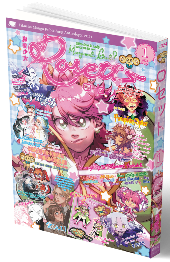
Rosett is a manga anthology inspired by Japanese comic magazines, such as Ribon and Margaret, in both content and aestethics. It is largely a collaborative effort between a group of comic artists that all takes inspiration from manga in their comics and art. For volume one we all contributed with a manga stories based on the theme magical girls. To really create the feeling of the japanese manga magazines we’ve also included bonus material such as quizzes, games, fanart and more.
As part of the editor team for volume #1 my specific responsibilities were:
- Making the logo for the anthology and for the “publisher” Fikasha.
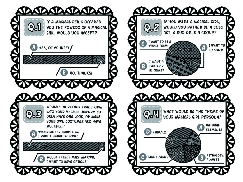
- Responsible for organising the bonus material.
- Create written material such as horoscopes.
- Creating graphical material, illustrations and help with layout.
- Creating promotional material and rewards for our ko-fi.
- General image processing, feedback and communication.
Logos
Fikasha
Fikasha is the official name for the group working on the anthology Rosett. When deciding on the name we combined the swedish word “fika” with the Japanese word “sha”. “Sha” means “company” and can be found in the name of many Japanese publishers, like Kodansha and Shueisha. “Fika” is a concept that has gained a little bit of fame outside of Sweden and in its most simple terms it means to have coffee/tea and something sweet together with friends.
When creating the logo I took inspiration from the name and decided on a design of a cup and combined this with a text element. The text element consists of both the western writing of the name as well as a kanji version.
Rosett
“Rosett” means “bow” in swedish and it’s a reference to one of the biggest shoujou-magazines in Japan, Ribon.
I wanted the logo to have all the flair and feeling that inhabits shoujou- manga and magazines and to make it extra true to it’s inspiration I included the katakana for “Rosett” in the logo.
Graphical material, illustrations and layout.
In addition to the logos I also worked on other graphical material for the anthology, as well as some of the layout, mainly for the bonus material. As part of the bonus material I also created illustratons for the zodiacs.

Editorial work and material.
Part of the bonus material were horoscope and to make it more interesting we chose to make the horoscopes fit the theme of the anthology, that is magical girls. For the greek zodiac I wrote magical girl-themed “stats” for each sign and for the chinese zodiac I wrote an origin story for a magical girl for each year. All participants, including me, also created illustrations for the different signs.
Promotional material and
Ko-fi rewards.
Advertisement
As part of our promotianal material I created an ad for the anthology that was printed in The Comic Art School of Malmö’s yearly anthology.
Ko-Fi Rewards
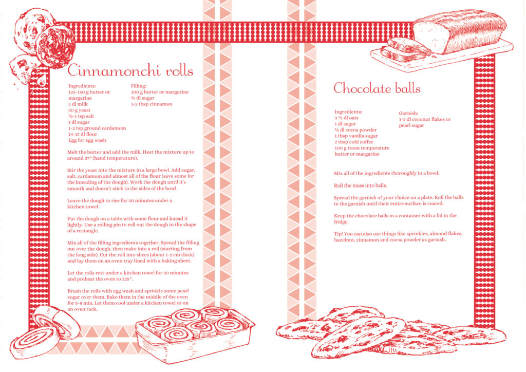
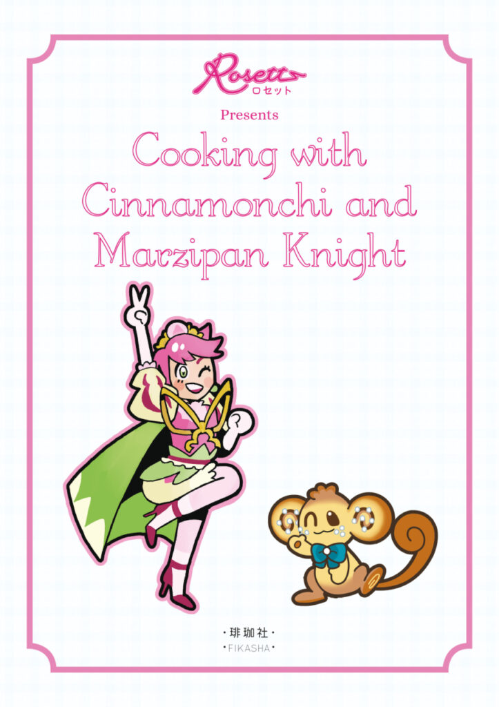
During the project we had a Ko-Fi campaign, crowdfunding part of the productioncost of the anthology, and I was in chrage of creating material for smaller donations. These rewards consisted of wallpapers for computers and phones and a small “cook booklet” with recipes originating from the different countries of the participants. I created the layout an patterns for these things using material and illustrations used in the anthology, for example the two mascots.
Manga oneshot.
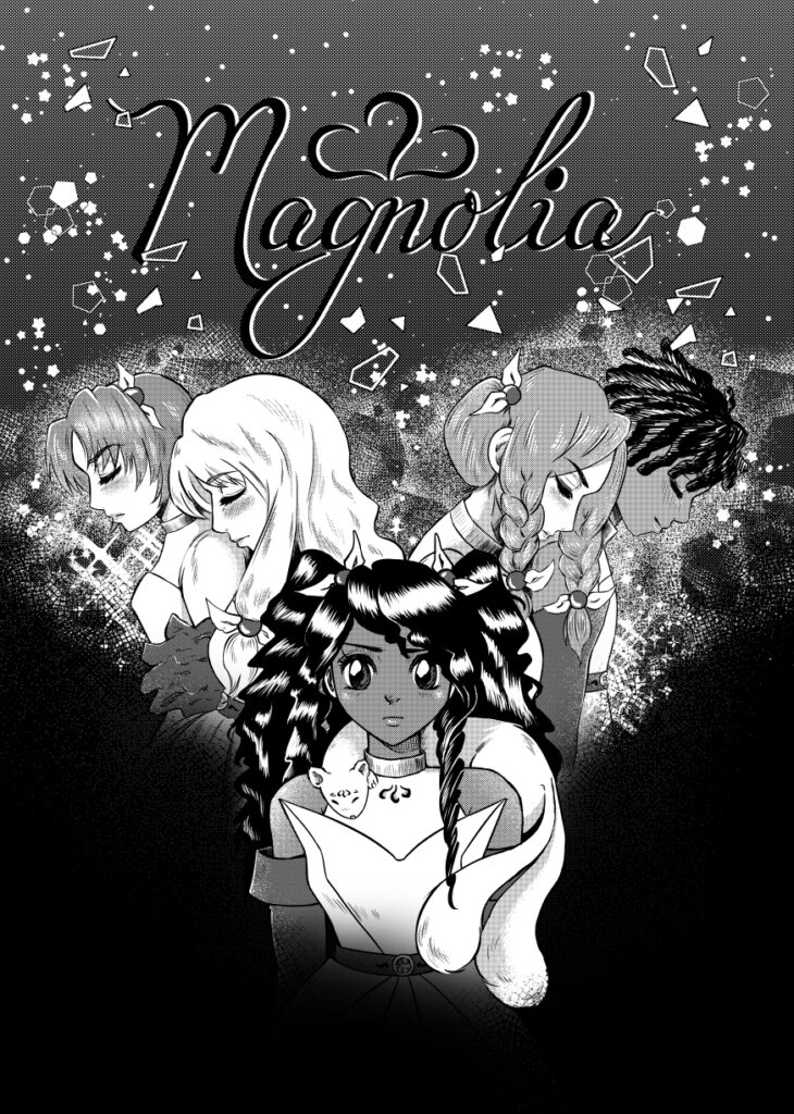
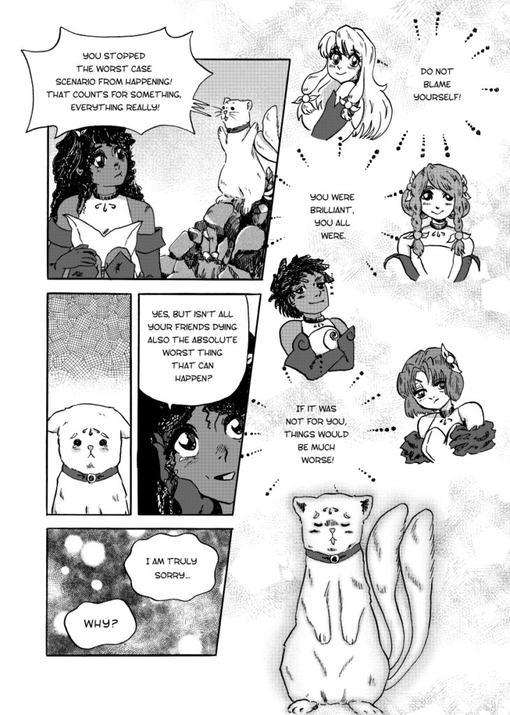
“In the quiet moment right after the battle is won, what goes through the minds of the ones left standing?”
Normally I write chronologically when making comics, but the idea that came to me demanded I did things the other way around.
I was thinking about the moment immediately after the heroine wins the fight and saves the world. Strangely enough, stories rarely linger on this part and instead jump to a point where the heroine has already processed what happened. I wanted to stay with my heroine in that moment after the fight and see what emotions could be explored. What is she thinking? What is she feeling?
